





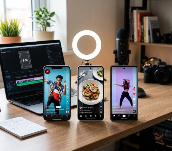
Mastering the ideal aspect ratios and safe zones per platform (Shorts, Reels, TikTok) is the single most effective way to prevent critical text, faces, and calls to action from being covered by native screen overlays. The standard vertical video format uses a 9:16 aspect ratio at 1080 × 1920 pixels across all three platforms. However, because each mobile app places its usernames, captions, engagement buttons, and audio labels in different regions, keeping your core messaging inside the central visual area guarantees complete visibility.
Creating content for modern mobile feeds requires precise visual planning. When a video is uploaded, the native user interface of the app lays interactive graphics directly over the frame. Placing key elements outside designated clear areas leads to obscured subtitles, clipped graphics, and lower viewer retention. Designing with mobile-first boundaries in mind ensures every message lands clearly regardless of the device being used.
To visualize the vertical layout structure, imagine a 1080 × 1920 pixel canvas divided into three vertical segments. The top 250 pixels form a risk zone occupied by channel headers, search bars, and status icons. The bottom 510 pixels from position 1410 to 1920 form another risk zone filled with captions, audio tags, and engagement triggers. This leaves a central safe design zone measuring 900 × 1160 pixels that remains completely unobstructed across all devices.
Understanding Vertical Video Technical Standards
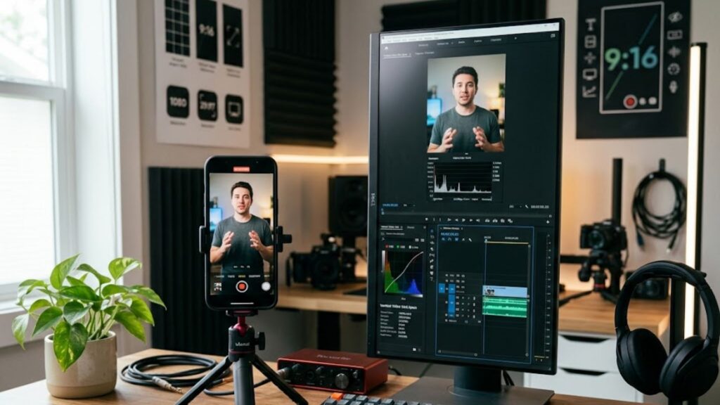
The foundation of modern short-form video production rests on full-screen vertical framing. Mobile displays are built for vertical orientation, making high-definition vertical presentation the default standard for creator platforms. Setting your project sequence to a 9:16 display aspect ratio ensures that your visual content fills 100% of a mobile device screen without awkward letterboxing or black borders along the sides.
While standard definition displays once relied on landscape formats, contemporary mobile delivery demands an exact resolution of 1080 × 1920 pixels. Operating at this resolution delivers sharp images while keeping render times manageable and bandwidth consumption efficient. Content creators utilizing an automated video production platform like Syllaby AI can streamline canvas setup from the outset, guaranteeing that raw source media aligns perfectly with native mobile displays.
Understanding the math behind vertical display proportions helps preserve visual structure during post-production. The proportion 9:16 represents a fractional dimension where height exceeds width by a factor of 1.77. Converting footage between ratios requires deliberate spatial adjustments:
- 9:16 Vertical (1080 × 1920 pixels): The default full-screen standard for modern mobile social platforms.
- 4:5 Portrait (1080 × 1350 pixels): A traditional feed standard used for vertical images and legacy video feeds.
- 1:1 Square (1080 × 1080 pixels): A balanced square format that creates black bars when displayed inside full-screen vertical feeds.
- 16:9 Landscape (1920 × 1080 pixels): The classic widescreen format which results in severe letterboxing on mobile devices.
When creators utilize proper 9:16 vertical video dimensions, they maximize physical screen coverage. This full-screen presence creates a more immersive viewer experience and signals production quality. Maintaining these foundational proportions prepares your video file for uniform processing across distribution systems.
Mastering Aspect Ratios and Safe Zones per Platform (Shorts, Reels, TikTok)
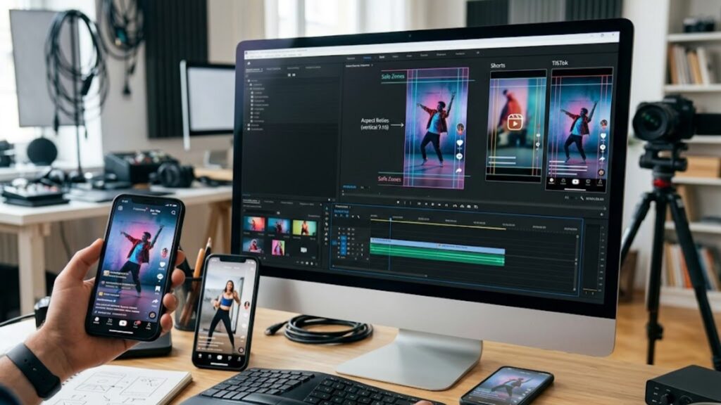
When evaluating aspect ratios and safe zones per platform (Shorts, Reels, TikTok), creators must balance canvas dimensions with mobile screen real estate. Although TikTok, Instagram Reels, and YouTube Shorts share the same full-frame canvas size, their native user interface elements differ significantly. Each application places interactive icons, caption blocks, and profile badges over distinct coordinates of the screen.
A safe zone is the specific central area of a video frame that remains entirely clear of app controls, buttons, and captions. These margins act as a protective boundary for essential visual communication. Keeping headlines, logos, primary subjects, and auto-captions within these borders prevents interface overlays from blocking your narrative.
Understanding these platform variations allows producers to design a single video master that functions seamlessly across networks. By studying the overlay patterns of each native app, you can position critical visual elements where they remain visible to every viewer.
TikTok Specs and Layout Constraints
TikTok features one of the most crowded native interfaces in short-form video. The right edge of the screen hosts a dense column of interactive buttons including profile avatars, like hearts, comment bubbles, save bookmarks, and share triggers. The lower third of the canvas features expanding text captions, sound titles, and promotional call-to-action banners.
To maintain visual clarity, key elements must avoid the bottom 300 pixels and the rightmost 120 pixels of the video frame. Creators tailoring content for specialized industry workflows should keep all secondary text labels centered horizontally. Applying a structured TikTok safe zone template inside your editor visualizes these danger zones prior to final rendering.
- Top Clearance: Leave at least 150 to 200 pixels clear at the top to avoid covering the Following/For You tabs and search bar.
- Bottom Clearance: Keep essential text 250 to 300 pixels above the bottom boundary to prevent caption bar collision.
- Right Margin Clearance: Position all text and graphic logos at least 120 pixels away from the right screen edge.
- Left Margin Clearance: Reserve a 60 pixel margin on the left side to account for screen padding variances across device models.
Instagram Reels Specs and Layout Constraints
Instagram Reels present unique layout challenges due to dual-feed distribution. Reels appear in full-screen vertical feeds, but they are also rendered inside the standard home feed at a $4:5$ aspect ratio and inside profile grids as a $1:1$ square. Your central framing must accommodate both full-screen viewing and cropped preview thumbnails.
The bottom zone of an Instagram Reel contains profile titles, audio attribution tags, and multi-line caption previews. Meanwhile, the right margin hosts standard engagement buttons. Creators generating vertical assets with a faceless video generator from Syllaby AI must place main titles near the upper-middle section of the screen so that grid cropping does not slice off key context.
- Top Boundary: Maintain a 220 pixel clearance from the top edge to avoid covering the Reels camera icon and tab navigation.
- Bottom Boundary: Keep critical elements 430 pixels above the base line to ensure readability over long post descriptions.
- Side Boundaries: Keep graphics 130 pixels away from the right edge and 60 pixels away from the left edge.
- Profile Grid Focus: Position core subjects within the center 1080 × 1080 pixel square for balanced grid previews.
YouTube Shorts Specs and Layout Constraints
YouTube Shorts offers a slightly cleaner interface than competing networks, but it still enforces strict margin limitations. The top portion of the frame features system status icons and navigation controls, while the bottom 450 pixels contain channel names, subscribe buttons, and video titles. The right side contains the standard engagement stack.
The official YouTube Shorts video resolution standard of 1080 × 1920 pixels works best when critical visual hooks sit inside a central 900 × 1160 pixel box. When developing scripts through an AI script generation tool, planning visual cues for this center box ensures that viewers read your hook instantly without UI interference.
- Top Interface Zone: Reserve 150 pixels at the top edge for system status bars and menu options.
- Bottom Interface Zone: Maintain a 450 pixel bottom margin to protect long titles and channel badges.
- Right Engagement Zone: Keep text graphics 150 pixels away from the right edge to avoid like and share buttons.
- Center Box Focus: Align all spoken captions within the center vertical third of the frame.
Technical Comparison of Mobile Video Specifications
The comparative breakdown below outlines the exact dimensional boundaries, safety margins, and interface constraints across major short-form platforms.
| Platform Name | Canvas Aspect Ratio | Recommended Resolution | Conservative Safe Area | Key UI Obstructions |
| TikTok | 9:16 Vertical | 1080 × 1920 px | 1080 × 1420 px | Right engagement column, bottom expanding caption bar, top sound pill |
| Instagram Reels | 9:16 Vertical | 1080 × 1920 px | 1080 × 1270 px | Bottom description text, right action icons, profile grid $1:1$ crop |
| YouTube Shorts | 9:16 Vertical | 1080 × 1920 px | 900 × 1160 px | Bottom channel badge and title, right like/dislike stack, top bar |
Best Practices for Typography, Graphics, and On-Screen Captions
Designing readable text for small mobile screens requires thoughtful visual hierarchy. Standard desktop typography principles do not translate directly to fast-scrolling vertical feeds. Viewers decide whether to keep watching within the first two seconds, so on-screen text must be immediately legible against dynamic video backgrounds.
To maximize readability, select bold, sans-serif typefaces with clean letterforms. Add strong contrast treatments, such as semi-transparent background boxes or high-contrast drop shadows, to keep text readable against varied lighting. When utilizing automated creation workflows, pre-setting typography templates guarantees consistent contrast across all generated scenes.
Organizing your screen elements into distinct horizontal bands keeps titles readable. Reserve the upper 250 pixels as clear top margin, and keep the lower 510 pixels clear of critical elements. Position your primary text hooks, bold sans-serif fonts, and centered headlines within the middle band between 250 and 1410 vertical pixels.
When placing subtitles, apply the following design guidelines to preserve visual balance:
- Horizontal Centering: Center all subtitle blocks horizontally on the canvas to maintain symmetry across different device screen widths.
- Line Count Limits: Limit text blocks to two lines per screen to prevent visual clutter and avoid creeping into lower UI zones.
- Font Sizing: Use minimum font sizes of 40 to 50 points in standard editing sequences so words remain legible on small mobile screens.
- Safe Alignment: Keep primary headline hooks in the upper-middle third of the canvas, roughly 300 to 500 pixels below the top edge.
Developers building automated video pipelines can leverage a developer video API to enforce caption placement parameters programmatically. Setting standardized text bounding boxes ensures that auto-generated subtitles never drift into dangerous edge areas.
Technical Export Standards for Mobile Video Delivery
Ensuring that your video renders crisp and clear requires adhering to modern export standards. Social media networks apply heavy compression algorithms during upload. Delivering source files with optimal bitrates, frame rates, and color profiles prevents pixelation, choppy motion, and audio synchronization glitches.
Exporting short-form assets through Syllaby AI applies pre-configured, platform-compliant compression profiles automatically. Content creators balancing production costs across flexible pricing plans benefit from exporting uniform master files that pass technical ingestion checks on the first attempt.
Mastering export parameters ensures your content retains high visual quality post-processing. Your master timeline should be set to 1080 × 1920 pixels at 60 fps or 30 fps. Use the H.264 video codec wrapped in an MP4 container, set variable bitrate encoding to 15 to 20 Mbps, render stereo audio using AAC-LC at 48 kHz and 320 kbps, and select the Rec.709 color space.
Adhere to these technical output settings when exporting master files from your editor:
- Container & Codec: Format files using the standard MP4 container with the H.264 video codec for broad compatibility.
- Frame Rate: Match source footage at either 30 or 60 frames per second, avoiding frame-rate conversions that cause motion stutter.
- Target Bitrate: Set variable bitrate encoding to a target between 15 Mbps and 20 Mbps for sharp 1080p detail.
- Audio Profile: Render stereo audio using the AAC-LC codec sampled at 48 kHz with a bitrate of 320 kbps.
- Color Space: Standardize export settings on the Rec.709 color space to prevent washed-out color shifts post-upload.
Common Video Framing Mistakes to Avoid
Even experienced video producers make layout errors when transitioning between landscape and vertical formats. The most frequent error involves placing subtitle tracks too close to the bottom of the frame. Because mobile operating systems and app controls sit at the bottom of the screen, low-hanging subtitles become unreadable.
Another frequent mistake is placing call-to-action arrows or logos along the right edge of the video. Because engagement buttons occupy the right margin on TikTok and Instagram Reels, right-aligned graphics get completely covered. Organizations looking to refine their vertical video strategy can get in touch with our team for specialized guidance on setting up platform-safe templates.
Avoid these common visual pitfalls during production:
- Letterboxing Horizontal Clips: Placing 16:9 horizontal video in a vertical canvas with top and bottom black bars drastically reduces visual impact.
- Ignoring UI Translucency: Assuming bottom captions are completely transparent; many native apps place gradient shadows over the lower third of the video.
- Edge-to-Edge Subtitles: Allowing long sentences to span the full 1080 pixel width, which causes outer words to be clipped by curved screen corners.
- Overcrowding Content: Packing too many graphic stickers, badges, and text blocks into the central area, overwhelming the main subject.
Syllaby AI solves these spatial layout challenges by automating template margins across short-form creation workflows. Standardizing your video production around protective safe boundaries ensures every asset delivers a clean visual experience.
Conclusion
Understanding aspect ratios and safe zones per platform (Shorts, Reels, TikTok) gives creators a clear competitive edge in mobile content feed engagement. By adhering to a standard 9:16 vertical canvas while honoring each app’s native UI margins, your visual messaging stays sharp, legible, and uncluttered. Applying structured templates during post-production protects your headlines, faces, and subtitles from being hidden by interactive platform elements.
Building a consistent habit of reviewing video assets against mobile overlay guides saves editing time and prevents costly post-upload re-renders. As short-form social platforms evolve their user interfaces, maintaining disciplined center-focused layouts ensures your content translates smoothly across every screen.
Frequently Asked Questions
What is a universal safe zone for vertical social media video?
A universal safe zone is a central bounding box measuring 900 × 1160 pixels placed directly in the center of a 1080 × 1920 pixel vertical canvas. Keeping all text, logos, and critical visual elements inside this box ensures complete visibility across TikTok, Instagram Reels, and YouTube Shorts without interference from native app interface overlays.
Why does my text get cut off or covered on TikTok?
Text gets covered on TikTok when placed outside the text-safe region. TikTok overlays an interactive column on the right edge and an expanding caption block at the bottom. Placing text within 120 pixels of the right edge or within 300 pixels of the bottom edge causes native buttons and captions to obscure your wording.
Can I upload 16:9 landscape videos to YouTube Shorts?
Yes, YouTube allows horizontal video uploads, but doing so creates wide black bars above and below the clip. This letterboxing format reduces visible screen coverage by roughly 50% and significantly lowers viewer retention compared to native 9:16 full-screen vertical uploads.
How do I preview safe zone overlays inside my video editor?
You can preview safe zones by adding a transparent PNG overlay template on the top video track of your timeline during editing. This template displays the buttons, captions, and profile badges of target social apps, allowing you to position titles accurately before hiding the guide track and exporting the final video.
Does Instagram crop vertical Reels on profile feeds?
Yes, Instagram crops 9:16 vertical Reels (1080 × 1920 pixels) to a 4:5 ratio (1080 × 1350 pixels) in the main feed and to a 1:1 square (1080 × 1080 pixels) on profile grids. Centering main titles and primary subjects inside the central square guarantees proper framing across all feed views.